

How to design intriguing picture framing
Colour in picture framing design
Colour plays a vital role in picture framing design. I recently read an article that stated-
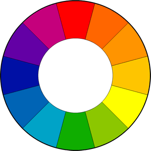
"Colour harmony is found by the use of a colour wheel. (Shown above). Harmonious colours are based on the key colour...
"The dominant colours must integrate when put together and make the scene look like it belongs together (which is the reason you use a colour wheel).
"Colour has to be used to make something look like it belongs together, not so it's pleasing."
(If you would like more info please send an e mail.)
I recently had a customer who didn't want to go with the ordinary "white on white" so I applied what is stated above and we chose an outrageous combo of red and orange, which turned out to look stunning!
Custom Picture Framing Design Tip # 42.
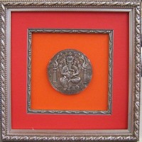
"Red and Orange should never be seen unless there's something in between" actually the jingle used the colours Blue and Green- either way similar colours particularly strong "popping" colours provide a challenge when laid beside each other. The combination of red, orange and indeed pink is seen more often in Eastern cultures. The above religious icon of Ganesh was brought in to Print Decor to be framed. I had to take a phone call and I offered for the customer to pick some colours he would like to use...
"OMG" I thought when he picked the 2 brightest colours in the sampler.
When we laid it out and placed a silver "fillet" between the 2 colours it worked beautifully. The petite but ornate frame gave this loved Hindu God justice.
There are times of course where no colour is the best option. Style and character of the frame are also vital factors.
Custom Framing Tip #1
1. Choose the frame that “sings” for your artwork as the most important aspect when choosing a frame. Believe it or not artwork of all types has personality and the right frame will bring out the best in the artwork.
Custom Framing Tip #41
Don't fear "going over the top." The Van Gogh below could hang quite comfortably even in a contemporary setting.
Framing a masterpiece like a masterpiece completes the vision."
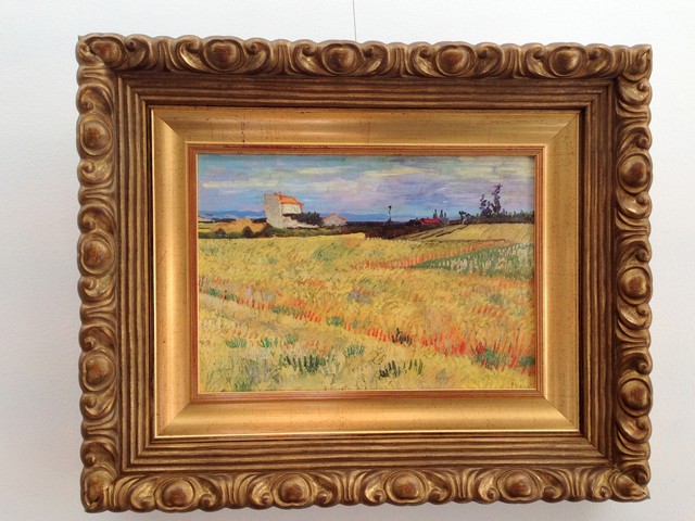
In the above framing we have combined 2 gilt frames the inner hand finished Italian gilt frame has been used instead of a cardboard mat thus preserving the style of the era. The outer frame is one of our beautiful Italian Bellini frames. A work of art itself. Note the red brown base (bole) beneath the burnished gold leaf. It compliments the red brown hues in the painting.
Lynne has an ongoing list of Custom Framing Design Tips.
Have a look on our web site >>>
Become a Print Decor subscriber-
Would you like to win a $500- gift voucher from Print Decor?
Become a subscriber and receive updates on new artists, exhibitions and discounts on mirrors and custom framing.
SUBSCRIBE NOW, CLICK THE LINK BELOW
Simply click here to subscribe
Designingly yours, Lynne & Bernie Lowenstein, Print Decor.
![]()
60 Glenferrie Rd, Malvern. 3144
Ph. 03 9576 1566